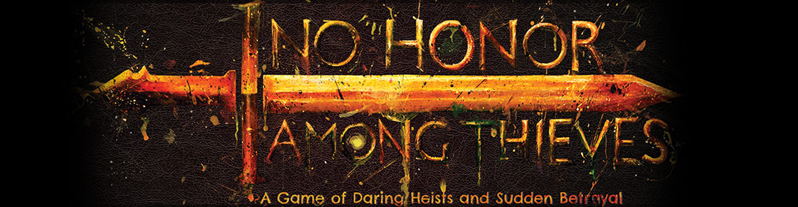
I’ve been working on card designs again. I like the basic designs I’ve come up with, but one very noticeable problem is that it’s difficult to distinguish different card types from each other when they’re all sitting face-up on the table. The only differences at a glance are the text and a small stripe of background color behind the bottom parchment section.
You can see what I mean here:
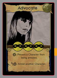
The red line, and the grey beyond it, is the approximate place the template assumes the card will be cut while printing–in my files the black border extends beyond it, to the edge of the image, but showing it like this gives a better idea of what the final card will look like.
So I’m working on some changes. The most obvious change that I could make would be changing the color of the different components on the card, the gold border pieces and the parchment especially. It was also suggested to me that I could get rid of the black border, which isn’t a bad thought. That black border is something that is traditional in card games, and is seen in a lot of them, as a way of hiding what color the front of the card is from the side while they’re stacked in a deck. Since all the cards in one deck in No Honor Among Thieves have the same background color, that’s not really a practical concern here, so I could potentially get rid of it.
Here you can also see that I’m experimenting with alternate ways of displaying the Character’s recruitment cost. The coin that I currently have looks nice, but it also just kind of floats above the parchment background that it’s on, which feels weird. A simple coin icon and a number gets the job done in less space and with less fuss.
This solution to the problem doesn’t look bad, I guess, but I do like the vibrant parchment color I have on the old design.
This variant has got some good contrast between the important part of the card (warm colors) and the background (cooler and darker colors), while still having a sizable colored border to keep it distinct from other card types.
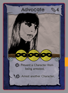
When I started writing this post I was going to ask for suggestions and reactions to these three variants, but now that I’m looking them over again…I kind of like this third one. The contrast between the blue background and the orange paper is just lovely, the black border really isn’t needed, and overall it looks better than I thought it would when I threw it together to be a basic example of how the old design would look without the black edge. So I’ll probably end up going with that design, unless I come up with something dramatically better.
If anyone does have any thoughts or opinions, please do let me know. I also need to fix the issue with the current build where the No Honor icon is exactly the same as the dagger icon on the dice, which leads to a lot of understandable confusion when initially explaining the rules. I like the dagger icon, but I also think it looks better on the dice, so I’m open to suggestions as to what to change it to. Thus far my ideas are a broken dagger icon or a red-ink highlight behind the words of the No Honor ability.
Also, I think I need to change the name for “No Honor” abilities. That name has stuck for this long because I needed a name for it, not because it worked especially well for intuitive comprehension of the rules. I’m thinking something like Broken Code or Broken Honor abilities, so that the name tells you exactly when you can use the ability, but again I’m open to suggestions.
If you want to make suggestions but don’t know what those terms mean for the game, you can find a print-and-play with rules available to download in the sidebar.
Thoughts?
Leave a comment