I got some feedback from a few people who’s opinions I respect after my last post. Everyone agrees that the Character card is good, but there were plenty of suggestions as to how to improve the Defense template, specifically in regards to the bars behind the different icon sets that represent the different defense challenges. People said:
- Lighten the bars a little, and make them more narrow.
- Put a texture on the bars–it looks weird when they’re that smooth and everything else is paper, or marble, or rough stone.
- Maybe change them to something more thematic? Like a knife blade cutting behind the icons?
I’ve thrown together three different versions of the same Defense card based on that feedback, to try and decide what worked and what didn’t.
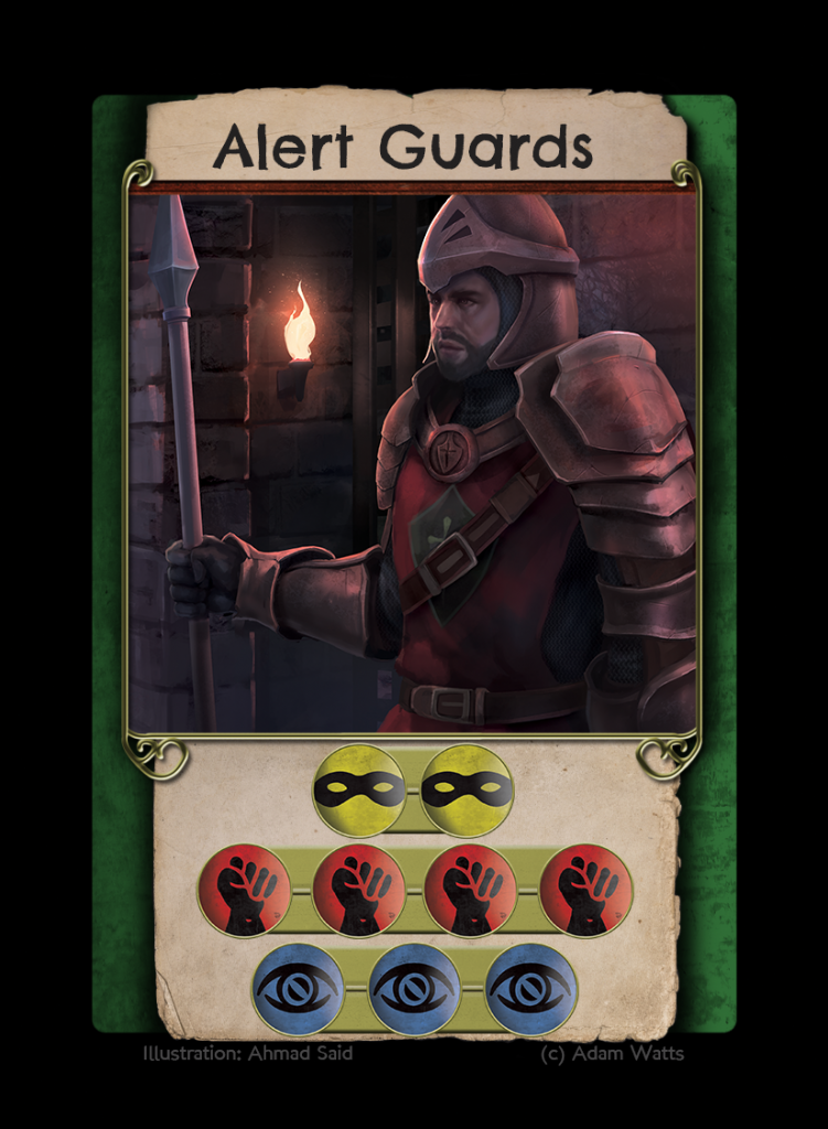
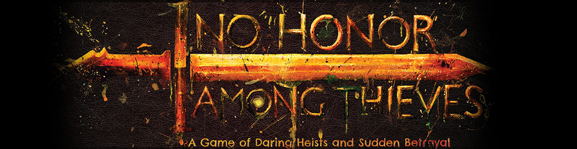
This first one is just the previous version with a slightly lighter bar and a subtle metal texture on it.
One of the issues I’ve been worried about is how to handle cards that have a lot of icons on them–the Alert Guards card is fine, but there are others with four rows of icons that are going to be tricky to fit into this space. This is a variant that attempts to provide a solution for the problem posed by those cards. I’m not sure how much I like it, to be honest–the red circle behind the number seems to me like it could be mistaken for just another Muscle icon if a player isn’t paying attention. The alternatives that I can see are either A) Use smaller icons on those cards, or B) Revise those cards so that they don’t have four rows of icons.
Actually, now that I’m looking over the cards again while looking for examples of what I’m talking about, there’s only one Defense that has four rows of icons…I think perhaps cutting that down would solve the problem at a stroke.
I think I’ll just do that. I’ll leave this card template up because it’s still an interesting concept, but I don’t think I’m actually going to use it.
Also, this template has slightly narrower bars than the others, which I think I’m going to carry over to the other designs.
This is a bit of a more dramatic one. I’m not entirely sure if it’s a good concept or not, but it’s interesting, at least. Something to get an opinion on, or suggestions to take it further if anyone has any ideas.
We’ll see where this takes us.
Leave a comment